Design, Direction
More Focused and Efficient Airbnb.com
Background and context
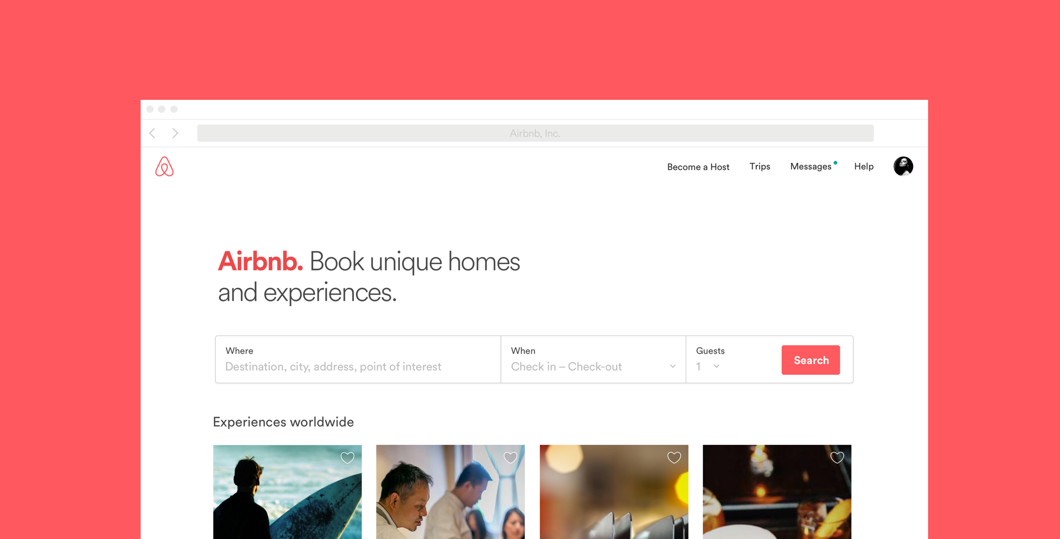
Airbnb home page was one of those sites that started the trend of large background images overlaid with text. It was a powerful element, but over it time became bit tired. Also the performance and readability can be troublesome with these designs, and they are not very friendly friendly for returning users. How many times do you really want to see the huge photo or video in the background?
Airbnb is much more well known, and mature company that it was few years ago, so I saw an opportunity to simplify and reduce the story we tell on this page, and focus on the things we actually offer, homes and trips.
Header
Wanted to follow very minimal Scandinavian, or Swiss style design of text on a white background and no-fluff. Similar design direction that we had for our mobile re-design.
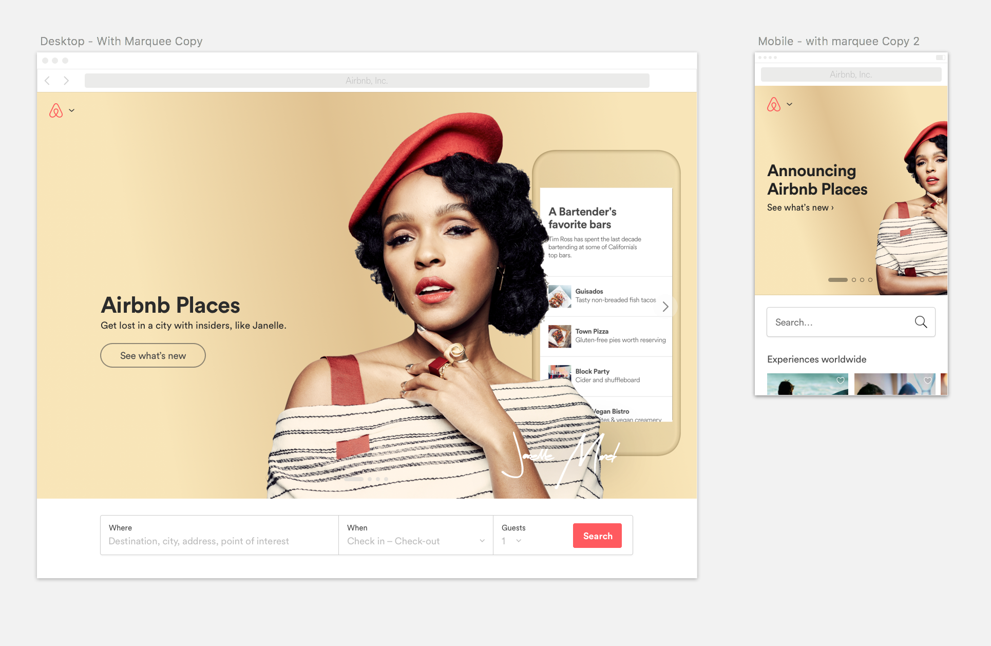
Promotions
The design can still offer place for timely promotions or product announcements without changing the core elements of the page. Also while designing this I built html mockups of the page in parallel, to see and understand what kind of systematic rule we need to create for these promotions to work well.
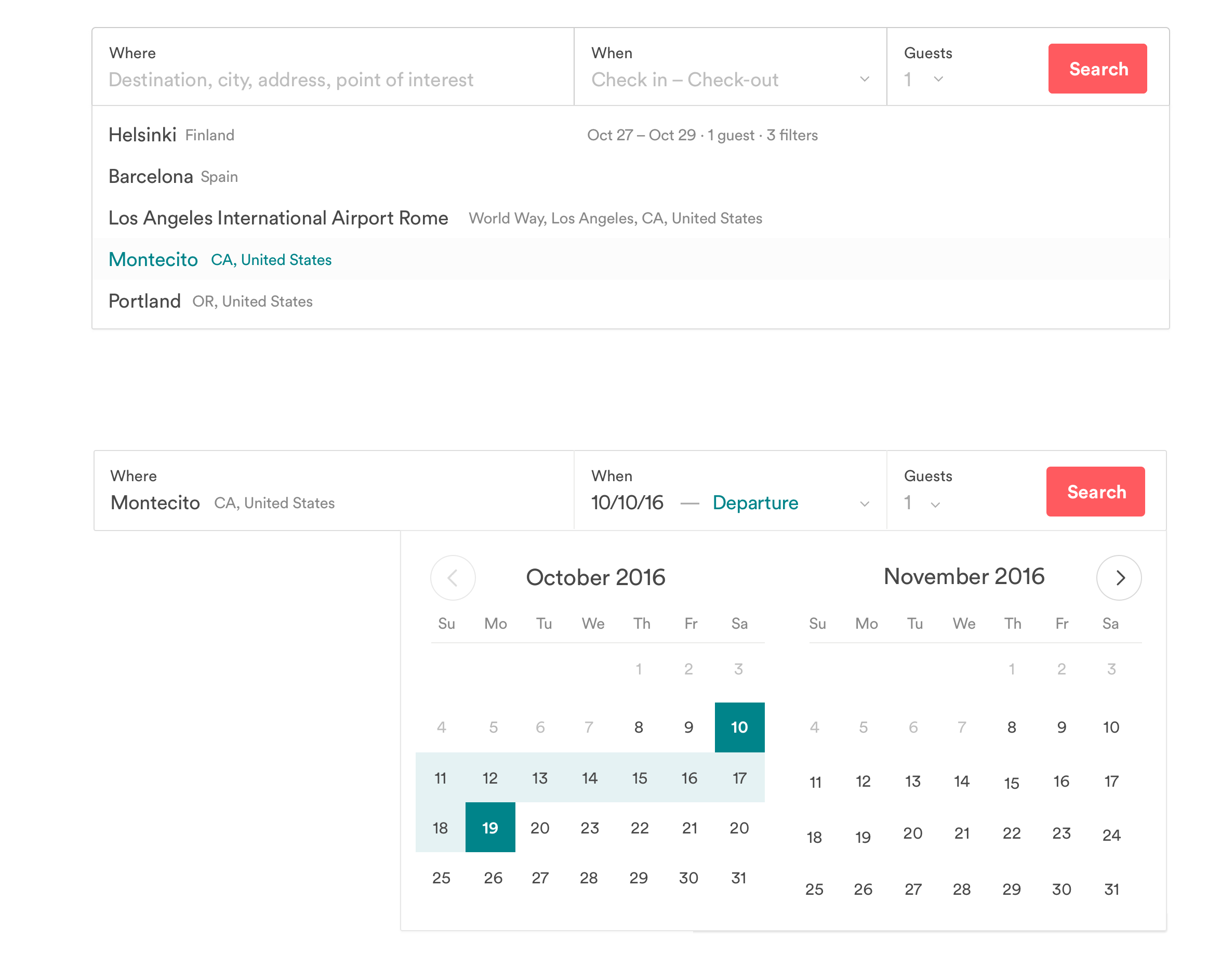
Search
The search bar is one of the most important functionalities on the Airbnb website. Most people use that to search on the site. With the improvements I aimed to make it more accessible, clear, and easy to use.
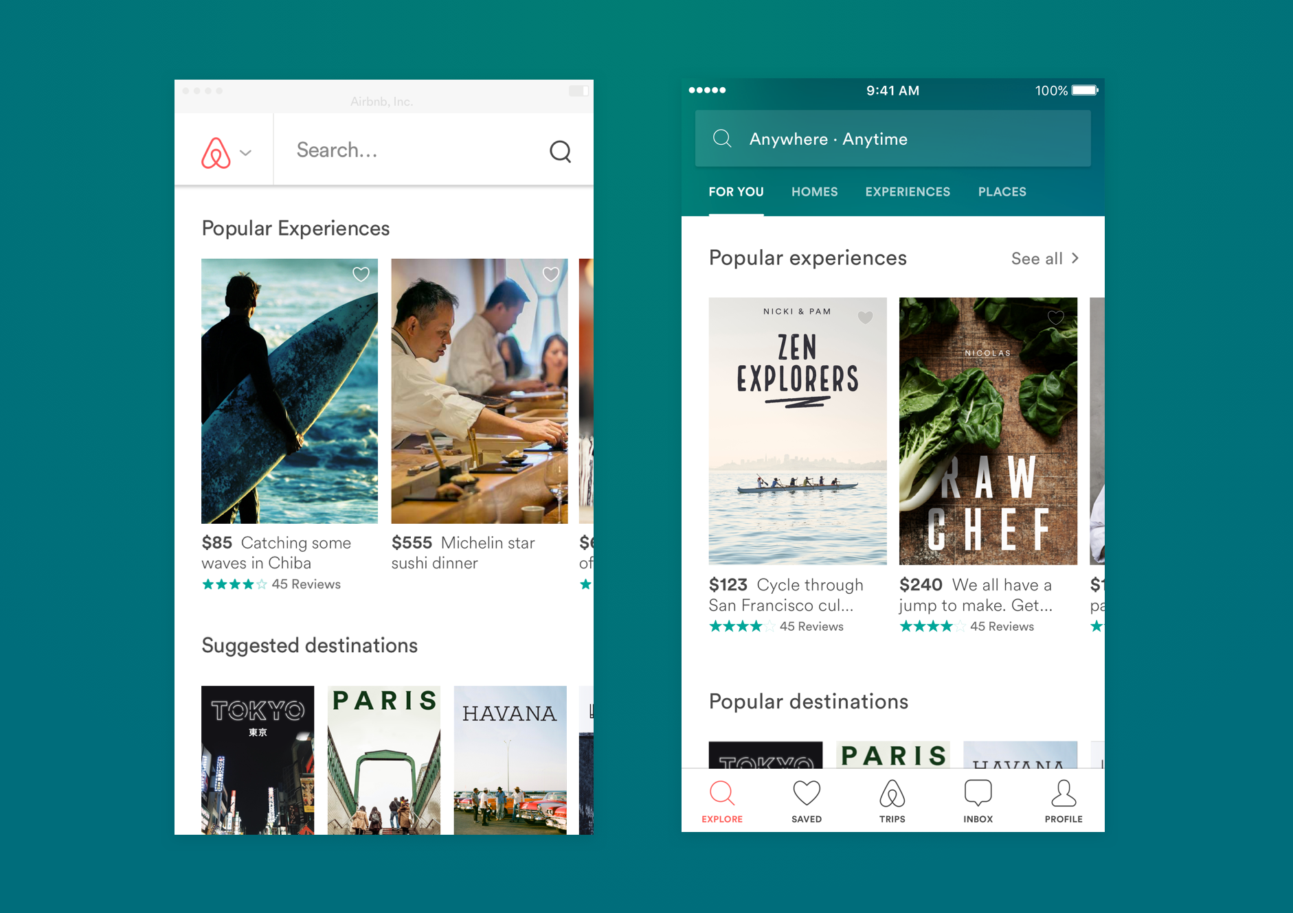
Pairing mobile web with native
One of the other requirements was improve the mobile web experience, pair it with our native app as much as possible. Both of these views are built our cross-platform design system.
Summary
The projects overall the results were positive from brand, load performance and metrics point of view. The less distracting design loaded faster and encouraged the user to use the product.